Home Assistant Lovelace mobile dashboard example

I hate to dig into thousands of lines of someone’s YAML code and think I’m not the only one. That’s why I decided to tear down my Lovelace dashboard here for everyone who wants to reuse its components or get some inspiration for their dashboards.
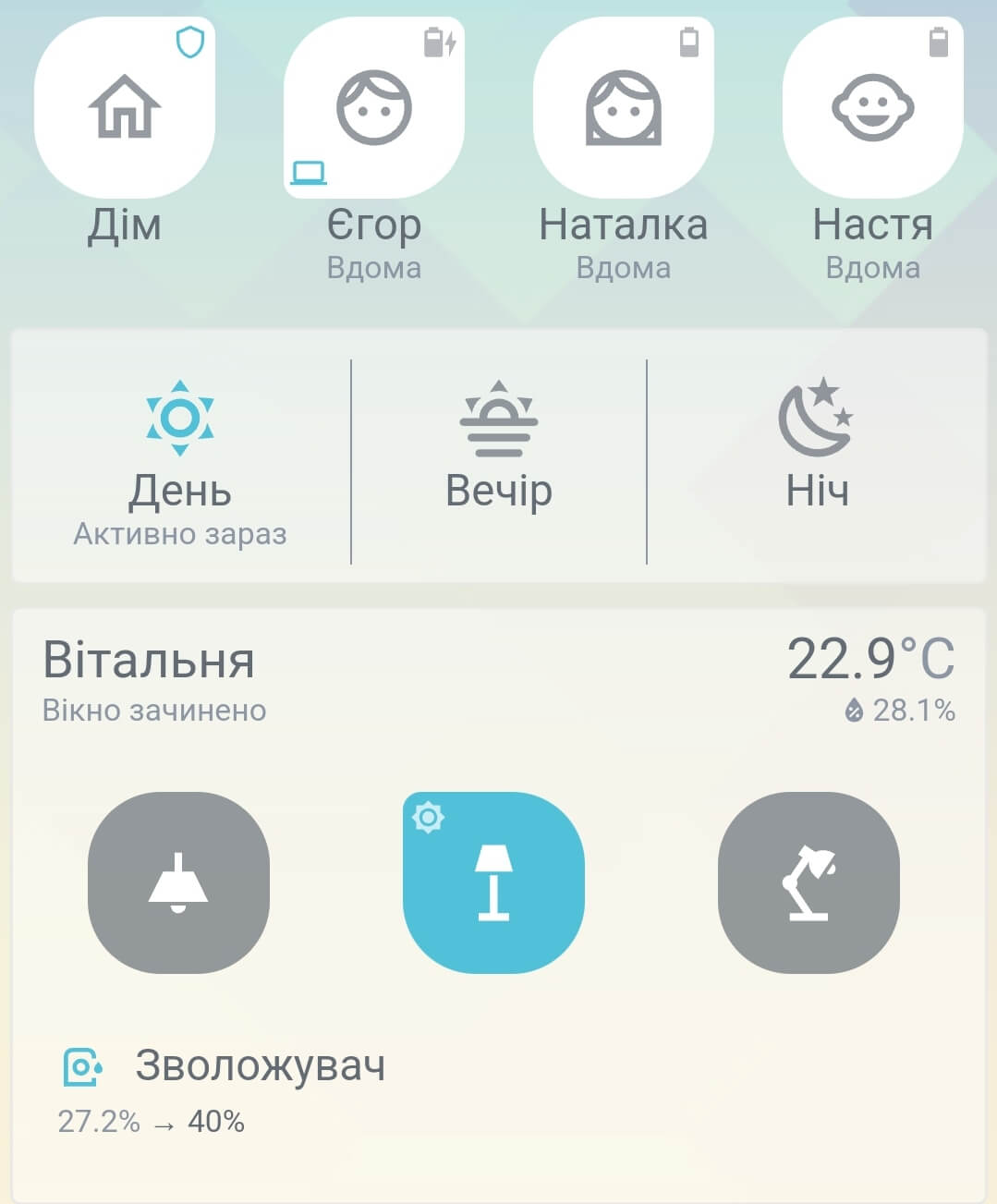
My Lovelace dashboard for mobile devices is a result of a year of searching, editing, and improving. The main card that made it look so nice is a great Button Card by RomRider – a really powerful tool to make whatever you want for your entities.

Theme
That was a Clear Theme from naofireblade at the beginning. But then I noticed that the last commit to Clear Theme was made more than a year ago and I also wanted to change the active entity color so now I’m maintaining and using a fork of Clear Theme.
Room state


Made using Custom Button Card templates. It contains the room name, a text representation of the window/door state, a movement indicator, temperature, and air humidity data. You can get a template and usage example in my custom button card templates collection.
Entity buttons

This is the main button on my dashboard. It is flexible and responsive and can display various icons in the corners. Everything can be configured through the variables of a custom button card. You can get a template and usage example in my custom button card templates collection.
Light buttons

This card is almost the same as the entity button, but with some changes. You can get a template and usage example in my custom button card templates collection.
Climate entities


The way to display my heaters and humidifiers. It is also a Custom Button Card with some additional styles and JavaScript templates. You can find it in the collection.
Operation mode switch

I have an input_select to control my home operating mode. It has five possible states: day, evening, night, away, and guest. Every mode button is a Custom Button Card. The central one has additional vertical border styles. See the layout for the information on how it is grouped in the single card, and template collection for the template.
Layout
I’m using Horizontal Stack Card to group button cards in a row without background like here:

But to group several button cards in one card with a custom background I’m using a more complex solution

This is a combination of Horizontal Stack Card, Stack In Card and card-mode.
Please remove comments if you can’t save this card in the Home Assistant UI editor.
type: custom:stack-in-card
keep:
  margin: true # To keep cards margin inside a stack-in-card
card_mod: # card-mode styles. Adds a semi-transparent background and a bottom padding
  style:
    .: |
      ha-card {
        background: #ffffff77;
        padding-bottom: 16px;
      }
cards:
  - # Room state card
  - type: horizontal-stack
    cards:
      - # Light entity card
      - # Light entity card
      - # Light entity card
  - # Climate entity card


