Home Assistant Lovelace Custom Button Card templates collection
This is my collection of templates for the Custom Home Assistant Lovelace Button Card.

Badge
Flexible, responsive button showing additional state icons in the corners.
Template
badge:
  layout: vertical
  variables:
    size: 70
  tap_action:
    action: toggle
  hold_action:
    action: more-info
  custom_fields:
    top_left_info: |
      [[[
        if (variables && variables.top_left_icon) {
          var icon = variables.top_left_icon;
          if (variables.top_left_icon == 'battery') {
            var suffix = '-unknown';
            var prefix = '';
            if (variables.battery_entity) {
              var intBatteryLevel = states[variables.battery_entity].state;
              if (!isNaN(intBatteryLevel)) {
                  if (intBatteryLevel == 100)
                    suffix = '';
                  else if (intBatteryLevel > 9)
                    suffix = '-'+('' + intBatteryLevel)[0] + '0';
                  else
                    suffix = '-alert';

                  if (variables.charging_sensor && states[variables.charging_sensor].state == 'on') {
                    prefix = '-charging';
                    if (intBatteryLevel == 100)
                      suffix = '-100';
                    else if (intBatteryLevel < 10)
                      suffix = '-outline';
                  }
              }
            }

            icon = "mdi:battery"+prefix+suffix;
          }
          return `<ha-icon
                      icon="${icon}">
                      </ha-icon>`;
        }
        return "";
      ]]]
    top_right_info: |
      [[[
        if (variables && variables.top_right_icon) {
          var icon = variables.top_right_icon;
          if (variables.top_right_icon == 'battery') {
            var suffix = '-unknown';
            var prefix = '';
            if (variables.battery_entity) {
              var intBatteryLevel = states[variables.battery_entity].state;
              if (!isNaN(intBatteryLevel)) {
                  if (intBatteryLevel == 100)
                    suffix = '';
                  else if (intBatteryLevel > 9)
                    suffix = '-'+('' + intBatteryLevel)[0] + '0';
                  else
                    suffix = '-alert';

                  if (variables.charging_sensor && states[variables.charging_sensor].state == 'on') {
                    prefix = '-charging';
                    if (intBatteryLevel == 100)
                      suffix = '-100';
                    else if (intBatteryLevel < 10)
                      suffix = '-outline';
                  }
              }
            }

            icon = "mdi:battery"+prefix+suffix;
          }
          return `<ha-icon
                      icon="${icon}">
                      </ha-icon>`;
        }
        return "";
      ]]]
    bottom_left_info: |
      [[[
        if (variables && variables.bottom_left_icon) {
          var icon = variables.bottom_left_icon;
          if (variables.bottom_left_icon == 'battery') {
            var suffix = '-unknown';
            var prefix = '';
            if (variables.battery_entity) {
              var intBatteryLevel = states[variables.battery_entity].state;
              if (!isNaN(intBatteryLevel)) {
                  if (intBatteryLevel == 100)
                    suffix = '';
                  else if (intBatteryLevel > 9)
                    suffix = '-'+('' + intBatteryLevel)[0] + '0';
                  else
                    suffix = '-alert';

                  if (variables.charging_sensor && states[variables.charging_sensor].state == 'on') {
                    prefix = '-charging';
                    if (intBatteryLevel == 100)
                      suffix = '-100';
                    else if (intBatteryLevel < 10)
                      suffix = '-outline';
                  }
              }
            }

            icon = "mdi:battery"+prefix+suffix;
          }
          return `<ha-icon
                      icon="${icon}">
                      </ha-icon>`;
        }
        return "";
      ]]]
  styles:
    card:
      - background: unset
      - box-shadow: none
      - padding: 0
      - max-width: "[[[return variables.size + 'px';]]]"
      - margin: 0 auto
    img_cell:
      - background: var(--card-background-color, white)
      - width: "[[[return variables.size + 'px';]]]"
      - height: "[[[return variables.size + 'px';]]]"
      - border-top-right-radius: |
          [[[
            if (variables && variables.top_right_icon)
              return '10%';
            else
              return '40%';
          ]]]
      - border-bottom-right-radius: 40%
      - border-bottom-left-radius: |
          [[[
            if (variables && variables.bottom_left_icon)
              return '10%';
            else
              return '40%';
          ]]]
      - border-top-left-radius: |
          [[[
            if (variables && variables.top_left_icon)
              return '10%';
            else
              return '40%';
          ]]]
    icon:
      - width: "[[[return variables.size/2 + 'px';]]]"
      - color: var(--paper-item-icon-color)
    state:
      - color: var(--secondary-text-color)
      - font-size: 12px
    custom_fields:
      top_left_info:
        - color: |
            [[[
              if (variables && variables.top_left_icon && variables.top_left_icon == 'battery')
                return "var(--paper-item-icon-color)";
              else
                return "var(--paper-item-icon-active-color)";
            ]]]
        - display: block
        - position: absolute
        - left: 0
        - top: 0
        - height: "[[[return variables.size/5 + 'px';]]]"
        - width: "[[[return variables.size/5 + 'px';]]]"
        - font-size: 0
        - padding: 4%
        - opacity: |
            [[[
              if (variables && variables.top_left_icon && variables.top_left_icon == 'battery')
                return "0.7";
              else
                return "1";
            ]]]
      bottom_left_info:
        - color: |
            [[[
              if (variables && variables.bottom_left_icon && variables.bottom_left_icon == 'battery')
                return "var(--paper-item-icon-color)";
              else
                return "var(--paper-item-icon-active-color)";
            ]]]
        - display: block
        - position: absolute
        - left: 0
        - top: "[[[return variables.size + 'px';]]]"
        - height: "[[[return variables.size/5 + 'px';]]]"
        - width: "[[[return variables.size/5 + 'px';]]]"
        - font-size: 0
        - padding: 4%
        - transform: "[[[return 'translateY(-100%)';]]]"
        - opacity: |
            [[[
              if (variables && variables.bottom_left_icon && variables.bottom_left_icon == 'battery')
                return "0.7";
              else
                return "1";
            ]]]
      top_right_info:
        - color: |
            [[[
              if (variables && variables.top_right_icon && variables.top_right_icon == 'battery')
                return "var(--paper-item-icon-color)";
              else
                return "var(--paper-item-icon-active-color)";
            ]]]
        - display: block
        - position: absolute
        - right: 0
        - top: 0
        - height: "[[[return variables.size/5 + 'px';]]]"
        - width: "[[[return variables.size/5 + 'px';]]]"
        - font-size: 0
        - padding: 4%
        - opacity: |
            [[[
              if (variables && variables.top_right_icon && variables.top_right_icon == 'battery')
                return "0.7";
              else
                return "1";
            ]]]
Usage
We will use variables to configure our button. Don’t forget to add any entity mentioned in variables to the triggers_update list.
For the additional icons in the corners, we will use JavaScript templates and/or the battery keyword. If you are using battery for any of the icons, battery_entity is required and charging_sensor is optional.
The list of available icon possitions:
bottom_left_icontop_left_icontop_right_icon
If you want to hide any of the icons, you need to remove the corresponding variable or use return null; in the JavaScript template.
Use size variable instead of default size field to configure button size.
Please remove comments if you can’t save this card in the Home Assistant UI editor.
type: custom:button-card
entity: person.yegor # Any entity do display
icon: mdi:face-man-outline # Icon override
tap_action: # Tap action ovveride. The default is "toggel" defined in template
  action: more-info
template: badge
show_state: true
triggers_update: # The list of entities for additional icons used in "variables" should also be added here
  - binary_sensor.yegor_sleeping_home
  - binary_sensor.yegor_home_on_call
  - binary_sensor.yegor_wfh
  - sensor.sm_g996b_battery_level
  - binary_sensor.sm_g996b_is_charging
variables: # The main configuration for the button
  size: 100 # The base button size in pixels
  bottom_left_icon: | #
    [[[
      if (states['binary_sensor.yegor_sleeping_home'].state == 'on')
        return "mdi:bed";
      else if (states['binary_sensor.yegor_home_on_call'].state == 'on' ) {
        return "mdi:headset";
      } else if (states['binary_sensor.yegor_wfh'].state == 'on' ) {
        return "mdi:laptop";
      }
      return null;
    ]]]
  battery_entity: sensor.sm_g996b_battery_level
  charging_sensor: binary_sensor.sm_g996b_is_charging
  top_right_icon: battery
Light
Inherits badge to change some options and add additional brightness icons. That means you need to have a badge template included in your button_card_templates.

Template
light:
  template: badge
  show_name: false
  variables:
    top_left_icon: |
      [[[
        if (entity && entity.attributes && entity.attributes.brightness && entity.attributes.brightness != '') {
          if (entity.attributes.brightness > 240) {
            return "mdi:brightness-7";
          } else if (entity.attributes.brightness > 125) {
            return "mdi:brightness-6";
          } else {
            return "mdi:brightness-4";
          }
        }
        return null;
      ]]]
  styles:
    custom_fields:
      top_left_info:
        - color: var(--card-background-color, white)
        - opacity: 0.7
    icon:
      - color: var(--card-background-color, white)
    img_cell:
      - background: |
          [[[
            if (entity && entity.state == 'on')
              return 'var(--paper-item-icon-active-color)';
            else
              return 'var(--paper-item-icon-color)';
          ]]]
Useage
You can use any variable from the badge here. But the simplest config is:
type: custom:button-card
template: light
entity: light.hallway
Room state
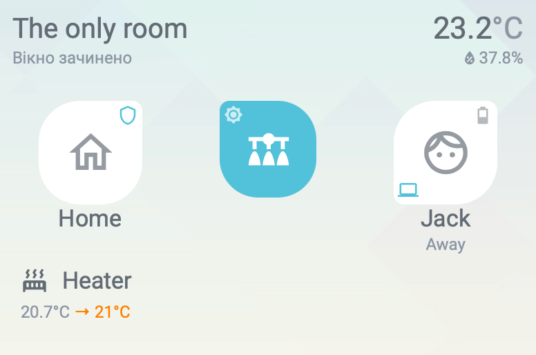
Shows the name of the room with additional data from environmental sensors, like window/door sensors, temperature and humidity sensors, or movement sensors.

Template
room_state:
name: "[[[return variables.name;]]]"
show_label: true
show_state: true
label: |
[[[
if (variables && variables.window_sensor && states[variables.window_sensor].state == 'on')
if (variables.window_sensor_is_door)
return `The door is <b style="color: var(--paper-item-icon-active-color);">open</b>`;
else
return `The window is <b style="color: var(--paper-item-icon-active-color);">open</b>`;
else if (variables && variables.window_sensor && states[variables.window_sensor].state == 'off')
if (variables.window_sensor_is_door)
return `The door is closed`;
else
return `The widnow is closed`;
return ' ';
]]]
custom_fields:
humidity: |
[[[
if (variables && (variables.humidity_sensor || variables.termostat_humidity_sensor))
return `<span style="font-size: 12px; color: var(--secondary-text-color);vertical-align: top; float: right;"><ha-icon
icon="mdi:water-percent"
style="width: 14px; height: 14px;vertical-align: top; vertical-align: top; margin-top: -1px">
</ha-icon>` + states[variables.humidity_sensor || variables.termostat_humidity_sensor].state + states[variables.humidity_sensor || variables.termostat_humidity_sensor].attributes.unit_of_measurement + `</span>`;
return '';
]]]
movement: |
[[[
if (variables && variables.movement_sensor && states[variables.movement_sensor].state == 'on')
return `<ha-icon
icon="mdi:walk"
style="width: 16px; height: 16px; color: var(--paper-item-icon-color)">
</ha-icon>`;
return ' ';
]]]
state_display: |
[[[
if (variables && (variables.temperature_sensor || variables.termostat_temperature_sensor))
return states[variables.temperature_sensor || variables.termostat_temperature_sensor].state + `<span style="color: var(--secondary-text-color);">` + states[variables.temperature_sensor || variables.termostat_temperature_sensor].attributes.unit_of_measurement + `</span>`;
return '';
]]]
styles:
grid:
- grid-template-areas: '"n movement space s" "l l l humidity"'
- grid-template-rows: min-content min-content
- grid-template-columns: min-content min-content 1fr min-content
name:
- align-self: center
- font-size: 20px
label:
- justify-self: start
- color: var(--secondary-text-color)
- font-size: 12px
state:
- justify-self: end
- font-size: 22px
custom fields:
movement:
- align-self: center
- justify-self: center
humidity:
- justify-self: end;
- color: var(--secondary-text-color)
card:
- pointer-events: none
- background: unset
- box-shadow: none
- padding: 0 4px 16px 4px
tap_action:
action: none
hold_action:
action: noneUsage
All configuration is done through variables, and don’t forget about triggers_update section.
The only mandatory variable is the name. Any other variable could be skipped if the room doesn’t have any particular sensor.
Please remove comments if you can’t save this card in the Home Assistant UI editor.
type: custom:button-card
variables:
  name: The only room # Room name
  window_sensor: binary_sensor.room_window # Window/door sensror in the room
  window_sensor_is_door: false # Set to 'true' if it shoud be a door state
  temperature_sensor: sensor.room_temperature # Room temperature sensor
  humidity_sensor: sensor.room_humidity # Room humidity sensor
  movement_sensor: binary_sensor.movement # Movement sensor in the room
template: room_state
triggers_update:
  - binary_sensor.room_window
  - sensor.room_temperature
  - sensor.room_humidity
  - binary_sensor.movement
Climate device
The base template for my heaters and humidifiers. It exists just to apply similar styles for climate devices and should be used in combination with a heater or humidifier template.
Template
climate_device:
  show_name: true
  show_icon: true
  show_state: false
  show_label: true
  layout: icon_name_state2nd
  tap_action:
    action: toggle
  hold_action:
    action: more-info
  size: 20px
  styles:
    card:
      - padding: 0
    grid:
      - grid-template-areas: '"i n" "l l"'
      - grid-template-columns: min-content 1fr
      - grid-template-rows: min-content min-content
    img_cell:
      - padding: 0 10px
    name:
      - justify-self: start
    label:
      - justify-self: start
      - padding-left: 10px
Usage
See heater or humidifier usage.
Heater
This card is displaying the state of the climate device with only two possible hvac_modes (heat and off) and with one preset_mode (away): but you can extend it to handle more. climate_device template is required.

Template
heater:
  label: |
    [[[
      var hvacStateColor;
      var targetText = '';
      if (entity.attributes.hvac_action == 'heating') {
        hvacStateColor = '#ff8100';
        targetText = ' → ' + entity.attributes.temperature + '°C';
      } else if (entity.attributes.preset_mode == 'away') {
        hvacStateColor = 'var(--secondary-text-color)';
        targetText = ' → away';
      } else if (entity.attributes.hvac_action == 'idle') {
        hvacStateColor = 'var(--primary-text-color)';
        targetText = ' → ' + entity.attributes.temperature + '°C';
      } else
        hvacStateColor = 'var(--secondary-text-color)';
      return `<span style="color: var(--secondary-text-color); font-size: 12px;">` + entity.attributes.current_temperature + `°C</span><span style="color: ` + hvacStateColor + `; font-size: 12px;">` + targetText + `</span>`;
    ]]]
  icon: |
    [[[
      if (entity.attributes.hvac_action == 'heating')
        return 'mdi:radiator'
      return 'mdi:radiator-disabled'
    ]]]
Usage
type: custom:button-card
entity: climate.child_room_heater
name: Heater
template:
  - climate_device
  - heater
Humidifier
I have an ESPHome-based humidifier. It is integrated into HA using Generic hygrostat. This integration doesn’t have different temperatures and actions, like Generic Thermostat, which is why I’m using a switch and a separate humidity sensor to display current and target humidity levels and the current humidifier state. climate_device template is required.

Template
humidifier:
  hold_action:
    action: more-info
  styles:
    icon:
      - color: |
          [[[
            if (states[variables.switch].state == 'on')
              return 'var(--paper-item-icon-active-color)';
            return 'var(--paper-item-icon-color)';
          ]]]
  label: |
    [[[
      var stateColor;
      var targetText = '';
      if (entity.state == 'off') {
        stateColor = 'var(--secondary-text-color)';
        targetText = ' → ' + entity.attributes.humidity + '%';
      } else if (entity.attributes.mode == 'away') {
        stateColor = 'var(--secondary-text-color)';
        targetText = ' → away';
      } else if (entity.state == 'on') {
        stateColor = 'var(--primary-text-color)';
        targetText = ' → ' + entity.attributes.humidity + '%';
      } else
        stateColor = 'var(--secondary-text-color)';
      return `<span style="color: var(--secondary-text-color); font-size: 12px;">` + states[variables.humidity_sensor].state + `%</span><span style="color: ` + stateColor + `; font-size: 12px;">` + targetText + `</span>`;
    ]]]
  icon: |
    [[[
      if (entity.state == 'on')
        return 'mdi:air-humidifier'
      return 'mdi:air-humidifier-off'
    ]]]
Usage
Please remove comments if you can’t save this card in the Home Assistant UI editor.
type: custom:button-card
entity: humidifier.living_room_humidifier
name: Humidifier
triggers_update:
  - switch.humidifier
variables:
  switch: switch.humidifier # ESPHome-provided swicth represents current humidifier state
  humidity_sensor: sensor.humidifier_humidity # ESPHome-provided sensor placed inside the humidifier
template:
  - climate_device
  - humidifier
Mode card
I have an input_select to control my home operating mode. It has five possible states: day, evening, night, away, and guest. This card is for displaying a button for mode switching. Each button has its own confirmation message, also defined in the template.

Template
mode_card:
  layout: vertical
  show_state: true
  entity: input_select.mode
  state_display: |
    [[[
        if (entity.state == variables.mode)
          return 'Active now';
        else
          return ' ';
    ]]]
  icon: |
    [[[
      switch (variables.mode) {
        case 'guest':
          return 'mdi:bag-suitcase';
        case 'day':
          return 'mdi:weather-sunny';
        case 'evening':
          return 'mdi:weather-sunset';
        case 'night':
          return 'mdi:weather-night';
        case 'away':
          return 'mdi:exit-run';
        default:
          return 'mdi:checkbox-blank-circle-outline'
      }
    ]]]
  name: |
    [[[
      switch (variables.mode) {
        case 'guest':
          return 'Guest mode';
        case 'day':
          return 'Day';
        case 'evening':
          return 'Evening';
        case 'night':
          return 'Night';
        case 'away':
          return 'Away';
        default:
          return 'WTF?'
      }
    ]]]
  tap_action:
    action: call-service
    service: input_select.select_option
    service_data:
      entity_id: input_select.mode
      option: "[[[return variables.mode]]]"
    confirmation:
      text: |
        [[[
          switch (variables.mode) {
            case 'guest':
              return 'Do you really whant to leave while there are guests at home?';
            case 'day':
              return 'Switching to the "Day"?';
            case 'evening':
              return 'Switching to the "Evening"?';
            case 'night':
              return 'Switching to the "Night"?';
            case 'away':
              return 'Nobody home?';
            default:
              return 'There is no such mode!'
          }
        ]]]
  hold_action:
    action: none
  size: 36px
  styles:
    state:
      - color: var(--secondary-text-color)
      - font-size: 12px
    icon:
      - color: |
          [[[
            if (entity.state == variables.mode)
              return 'var(--paper-item-icon-active-color)';
            else
              return 'var(--paper-item-icon-color)';
          ]]]
Usage
Here is an example of the three mode cards with vertical dividers added using card-mod. The card is using variables to defend the mode it represents.
type: horizontal-stack
cards:
- type: custom:button-card
  template: mode_card_en
  variables:
    mode: day
- type: custom:button-card
  template: mode_card_en
  styles:
    card:
      - border-right: 1px solid var(--secondary-text-color)
      - border-left: 1px solid var(--secondary-text-color)
  variables:
    mode: evening
- type: custom:button-card
  template: mode_card_en
  variables:
    mode: night